Flair Airlines
Optimizing Conversion Through User-Centric Design
HIGHLIGHT
Redesign Flair Airlines' mobile booking experience to increase conversion rates and create a more intuitive, seamless user journey that aligns with the brand's strategy for growth. This was presented as a comprehensive design challenge to demonstrate research methodology, design thinking, and strategic problem-solving skills during the hiring process.
ABOUT PROJECT
Flair Airlines, as a low-cost carrier, needed to maximize digital conversion while maintaining operational efficiency. The existing mobile experience was creating friction in the booking funnel, directly impacting revenue and user satisfaction. I redesigned Flair Airlines' mobile booking experience as a 4-day design challenge during a UX/UI designer interview process. The project required demonstrating end-to-end design thinking from research to implementation strategy.
MY ROLE
- Conducted competitive analysis and heuristic evaluation of existing mobile experience
- Synthesized research insights into actionable design opportunities
- Developed user journey maps and information architecture
- Created high-fidelity prototypes for core booking flows
- Presented strategic recommendations with projected business impact
CHALLENGE
How might we redesign Flair Airlines' mobile booking experience to reduce conversion friction while maintaining brand consistency and building user trust in a competitive low-cost carrier market?
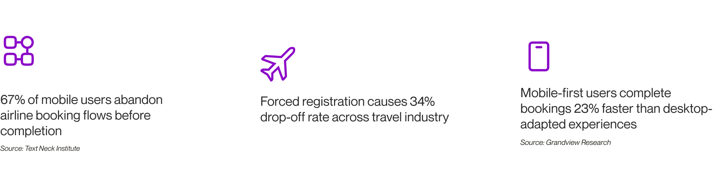
With mobile traffic accounting for more than 60% of airline bookings, poor mobile experiences directly impact revenue. Users expect seamless, fast booking flows that work flawlessly on mobile devices, especially for price-conscious travelers comparing multiple airlines.
DEFINING PROBLEM
Framing the right question: Understanding what prevents users from completing mobile bookings successfully.
The challenge focused specifically on mobile conversion optimization, but required understanding the broader context of low-cost carrier positioning, user expectations, and technical constraints within a 4-day timeline.
CONTEXT
I focused on travelers booking domestic Canadian flights through mobile devices. These users are typically price-sensitive, comparison shopping across multiple airlines, and expecting quick, transparent pricing and booking processes.
DISCOVER - COMPETITIVE ANALYSIS
After establishing the project scope, I conducted systematic analysis of competitor mobile experiences to understand industry standards and identify differentiation opportunities.
I analyzed 4 major airlines' mobile websites (WestJet, Air Canada, Ryanair, Porter) focusing on booking flow efficiency, authentication patterns, information hierarchy, and mobile-specific interaction design.
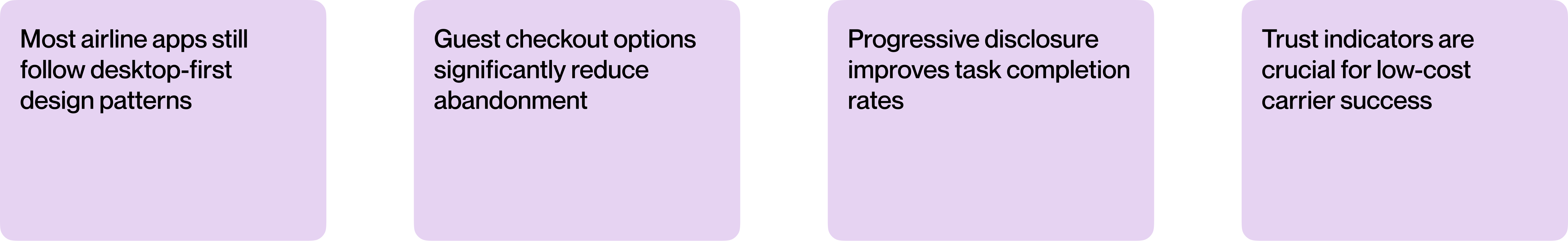
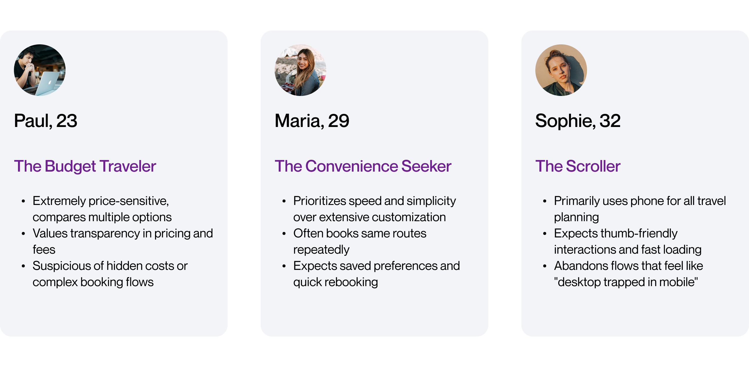
USER INSIGHTS
Based on online reviews, industry research, and heuristic evaluation, I identified three primary user types:
DESIGN STRATEGY
Increase conversion through friction reduction and trust building.
Users abandon mobile booking flows due to authentication barriers, information overload, and lack of confidence in the process. My strategy focused on creating a streamlined, transparent experience that builds trust while reducing cognitive load.
- Progressive disclosure that reveals information complexity only when users need it to prevent cognitive overload
- Trust through transparency using clear pricing displays, progress indicators, and policy information to build user confidence
- Seamless guest checkout flows that eliminate forced registration barriers and reduce conversion friction
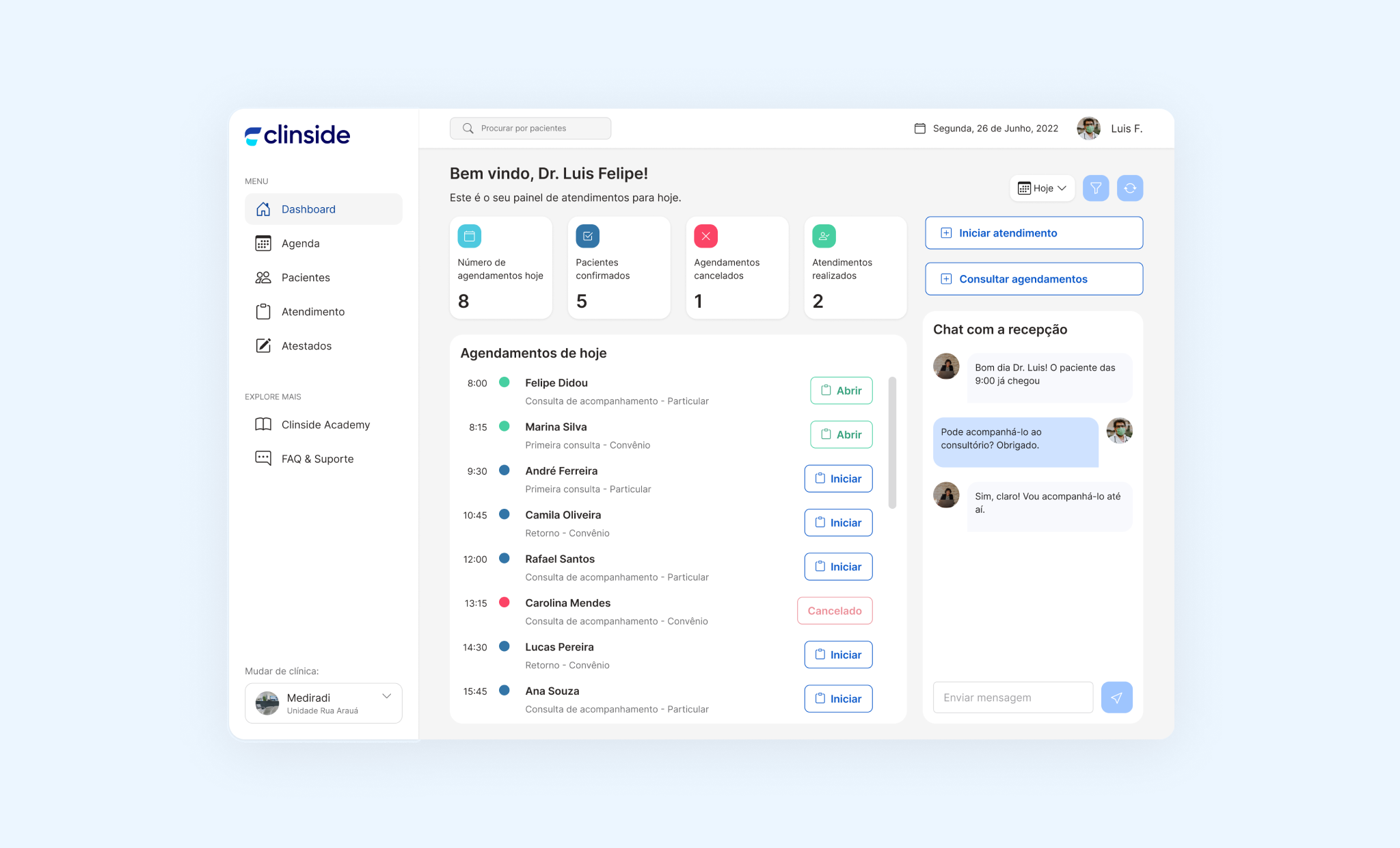
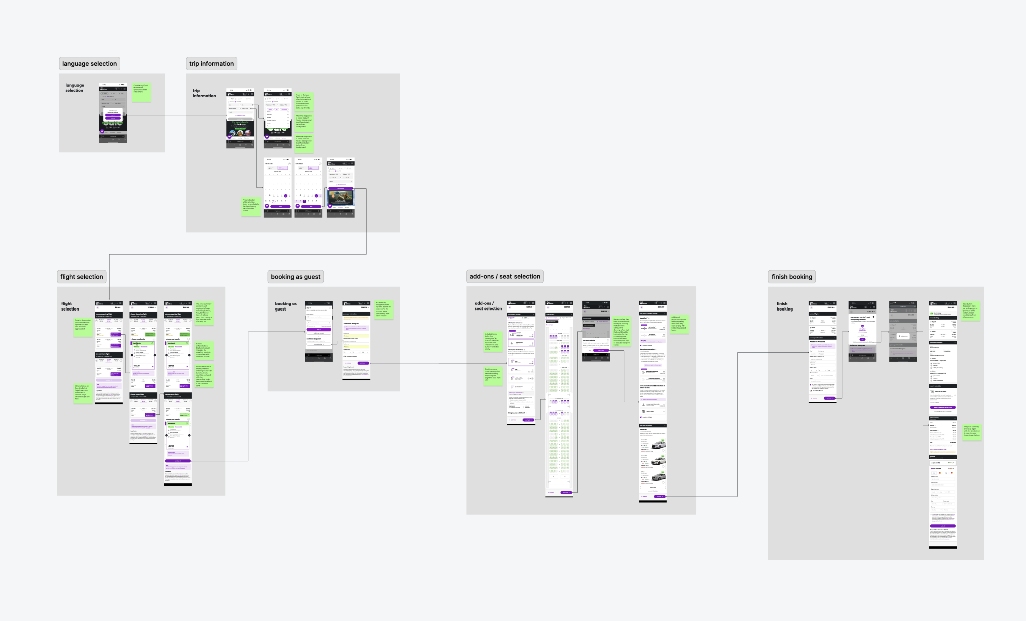
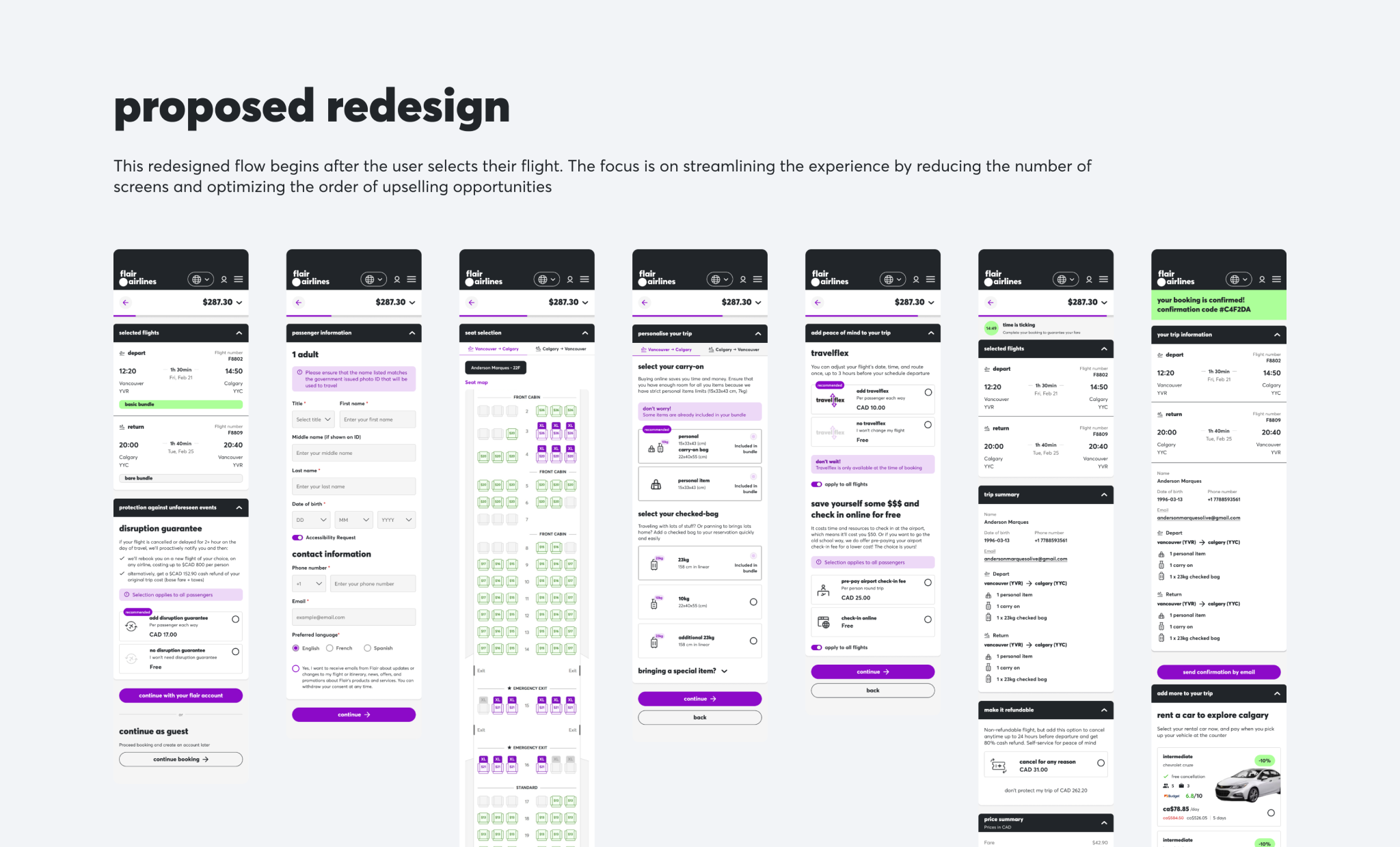
DESIGN - INFORMATION ARCHITECTURE & SCREEN FLOW
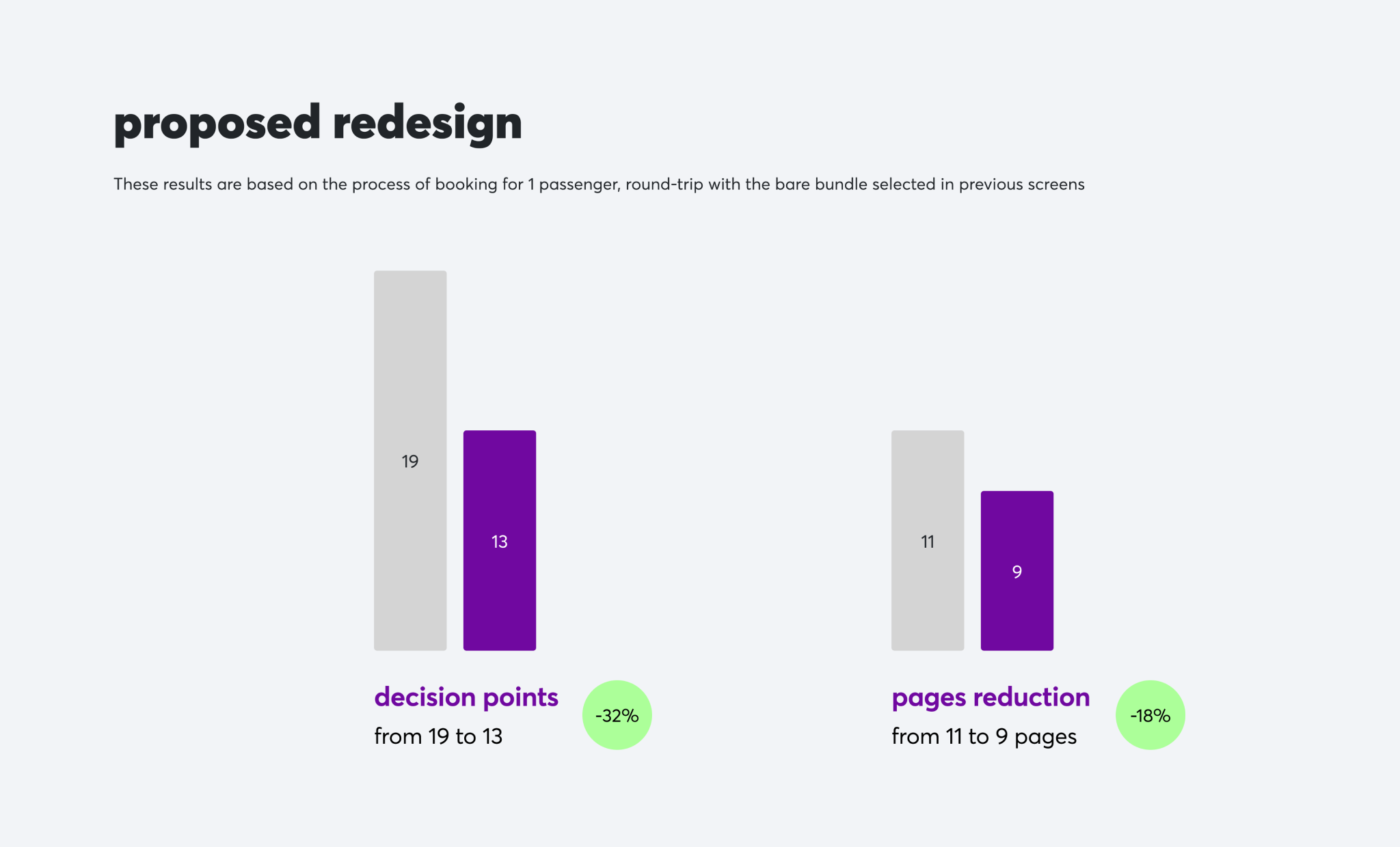
I mapped the current booking flow and redesigned it to eliminate unnecessary steps and decision points. The new architecture reduced the booking process from 11 to 9 core steps, also reducing the amount of decision points by 32%.
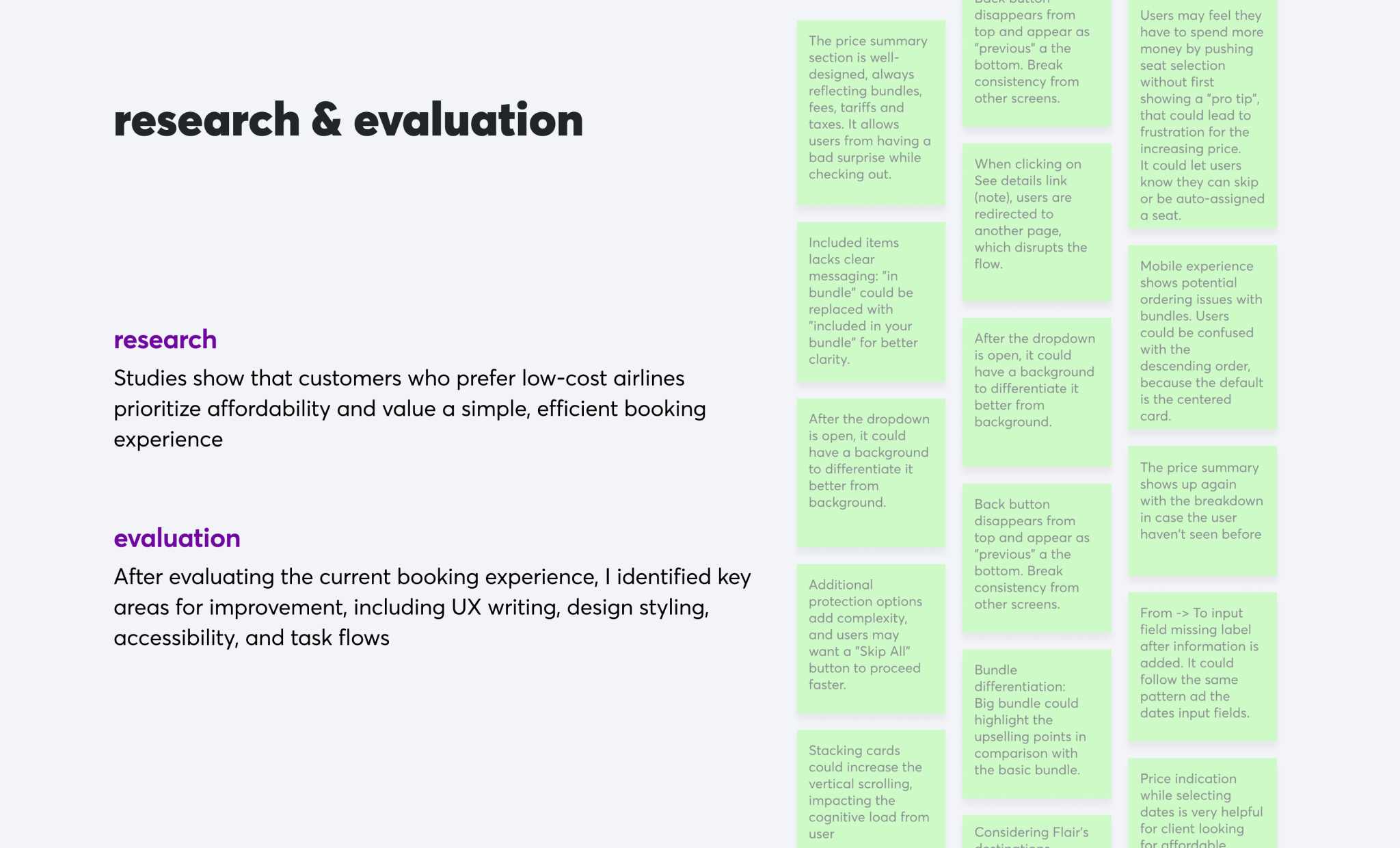
DESIGN EVALUATION
Through these evaluation sessions, I analyzed how users would interact with the proposed booking features, identifying friction points and conversion barriers
By prioritizing user needs and mobile-first principles, I designed a streamlined and intuitive booking experience, establishing a strong foundation for improved conversion rates and user satisfaction in the competitive airline market.
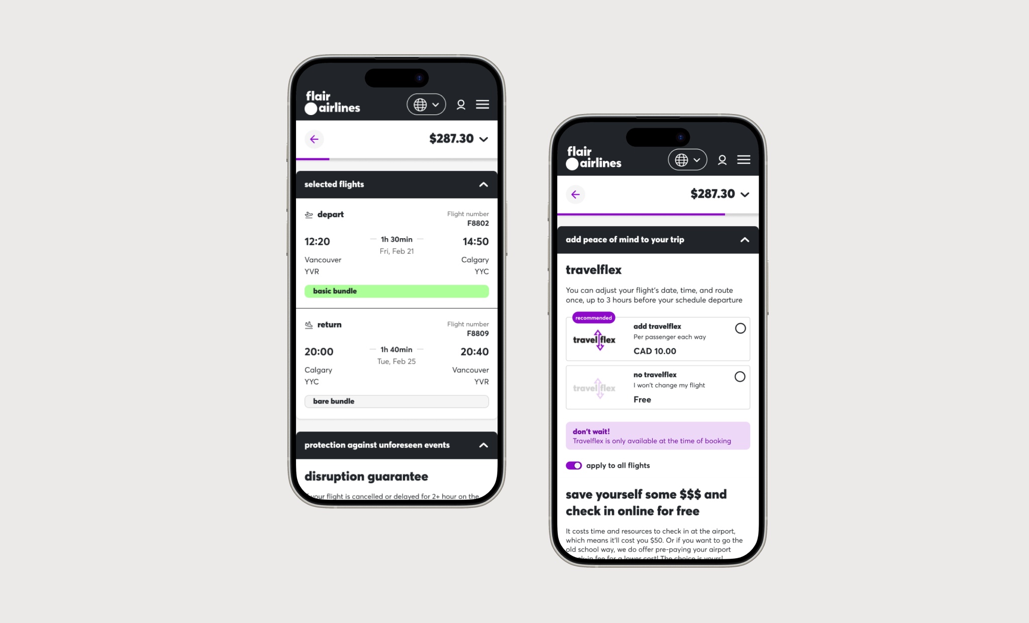
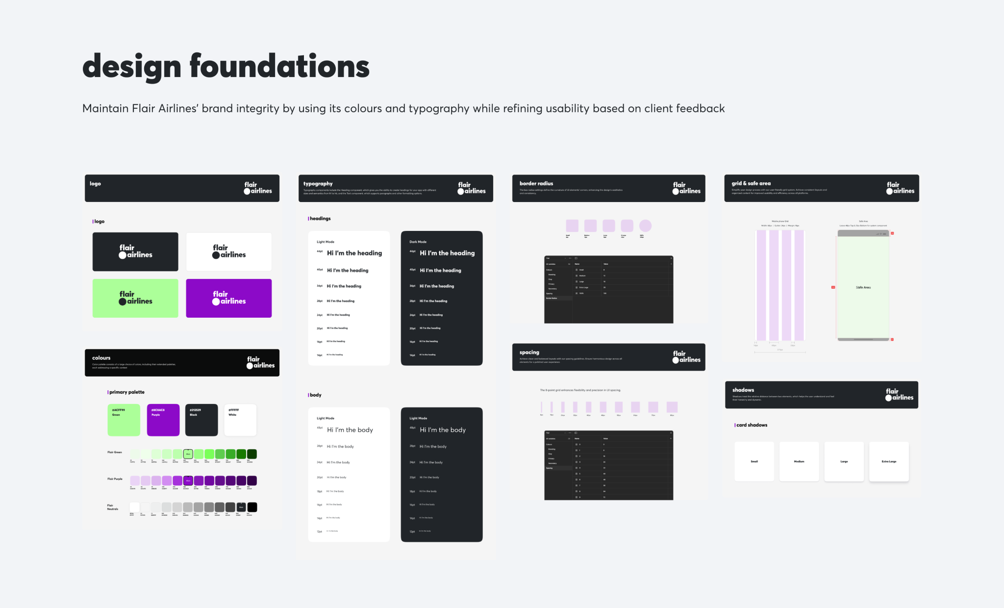
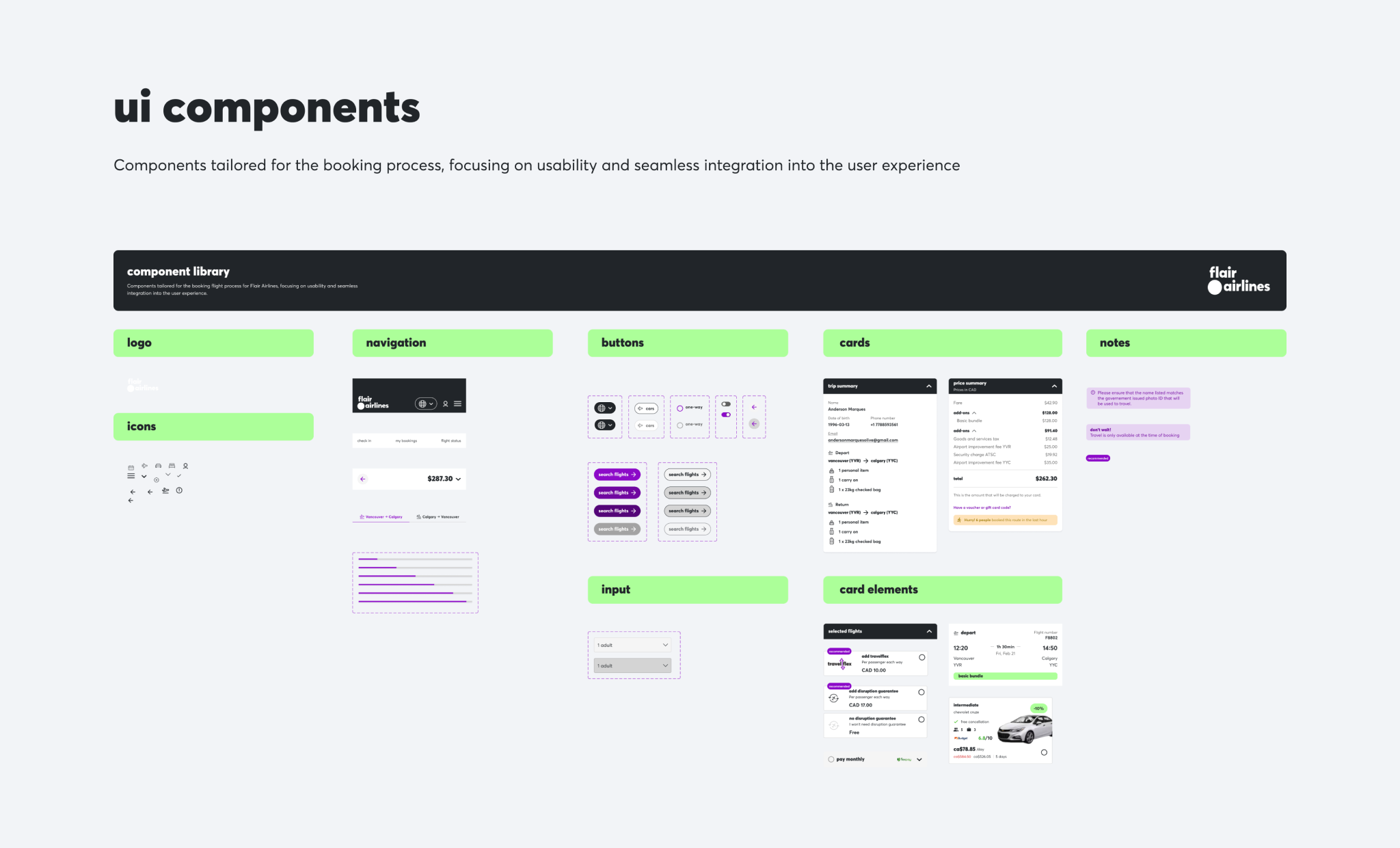
DESIGN - VISUAL BRANDING & UI COMPONENTS
Adherence to Flair's design system throughout redesign
All design decisions maintained strict alignment with Flair Airlines' visual branding guidelines, ensuring consistent use of brand primary and secondary colors throughout the booking flow, applying Flair's established font hierarchy and sizing standards for optimal readability, utilizing existing UI components from their design system wherever possible to maintain familiarity, preserving brand-consistent icon style and usage patterns, and following their established grid system and spacing principles to create visual harmony across all touchpoints.
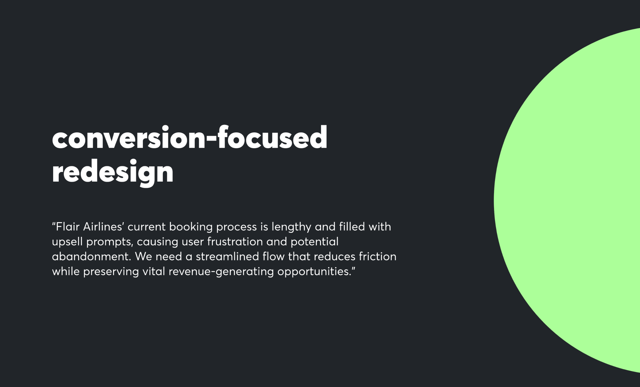
PROPOSED REDESIGN
A mobile-first booking experience that prioritizes speed, clarity, and user confidence.
The redesigned experience uses progressive disclosure, streamlined authentication, and mobile-optimized interactions to create a booking flow that feels native to mobile devices while building trust in the Flair Airlines brand.
SOLUTION
Flair Airlines' redesigned mobile experience revolutionizes airline booking by eliminating friction, streamlining the booking flow, and building user trust through transparent pricing and progress indicators.
SUCCESS CRITERIA
Measuring design impact through conversion-focused KPIs

MY TAKEAWAYS
User research validation was crucial even within tight timeline constraints.
Initially, I focused heavily on competitive analysis and industry best practices. However, validating assumptions through online review analysis and user scenario testing revealed specific pain points unique to low-cost carrier mobile experiences, particularly around trust building and pricing transparency.
Design challenges benefit from strategic constraint acknowledgment.
Working within a 4-day timeline taught me to balance thoroughness with efficiency, focusing research efforts on highest-impact insights while still demonstrating comprehensive design thinking.