Clarifying pricing and upsells to improve completion and confidence – 18% shorter flow, 32% fewer decisions

Project Overview
Flair Airlines is a Canadian low-cost carrier competing in a crowded market where operational efficiency and customer acquisition directly impact profitability. The airline's growth strategy depends on converting casual shoppers into confirmed passengers—a process heavily influenced by the digital booking experience.
When booking experiences feel lightweight and trustworthy, customers complete transactions. When they feel tedious and full of upsells, they abandon. Flair's existing flow created the latter impression.
Our main goals were...
Streamline the booking experience to feel quick and straightforward—matching user expectations for low-cost airlines
Maintain strategic upselling opportunities without increasing friction or appearing opportunistic
Build transparency into pricing so customers feel informed, not surprised at checkout
Strategic Value
Through evaluation of the current experience and research into customer behavior, I identified that the core problem wasn't what Flair was selling—it was how they were selling it. Information was fragmented across screens, upsell decisions were overwhelming, and the path to confirmation felt longer than necessary.
I developed a redesign strategy that prioritizes clear information hierarchy, removes redundancy, optimizes decision sequencing, and maintains pricing transparency to improve conversion rates while reducing customer support burden from confusion-related inquiries.
Outcomes
reduction in flow length (11 → 9 pages)
reduction in cognitive load (19 → 13 decision points)
faster booking completion
The Challenge
Flair's booking experience created friction at critical conversion moments, resulting in abandoned carts and confused customer support inquiries.
Overwhelming upselling: 19+ decision points before confirmation, each feeling mandatory
Confusing bundle messaging: "Included items" didn't clarify what passengers actually received
Mobile friction: Stacked add-on cards created excessive vertical scrolling (~32% more than necessary)
Premature seat selection: Users pushed to select seats before understanding the value or cost
Defining my research question
Framing the right question: Understanding what prevents users from completing mobile bookings successfully.
How might we restructure the booking flow around customer decision-making patterns rather than institutional convenience, enabling customers to complete purchases confidently while preserving revenue from strategic upselling?
Understanding the existing experience
To understand the origin causes of abandonment and confusion, I conducted a comprehensive heuristic evaluation and competitor analysis of the existing experience
Evaluation Findings
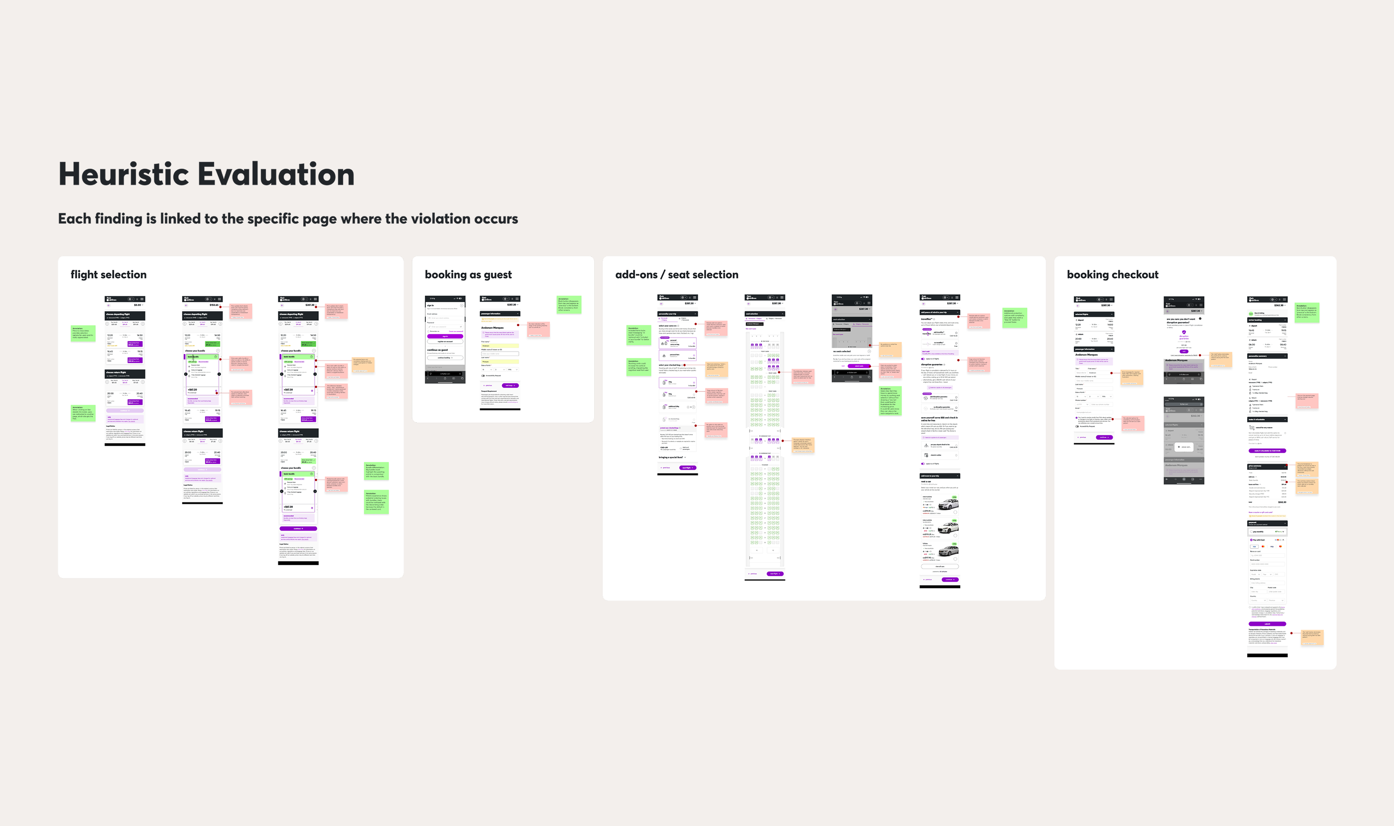
After evaluating the current booking experience, I prioritized these key areas for improvement:
Too many add-on options distracting the user from the main booking flow
Bundles lacked clarity in labels and UI
Deceptive patterns confusing seat selection, especially for free or auto‑assigned seats
Redundant pages and reviews made the flow feel longer than it needed to be
Competitor Analysis
I analyzed 4 major airlines' mobile websites (WestJet, Air Canada, Ryanair, Porter) focusing on booking flow efficiency, authentication patterns, information hierarchy, and mobile-specific interaction design.

My proposed solution
Design recommendation 1 – Simplify flow and add‑on options
The Problem This Solved
The booking flow was very long and multiple add‑ons were present across different screens, creating a lot of micro‑decisions that disencouraged users from completing the main booking task.
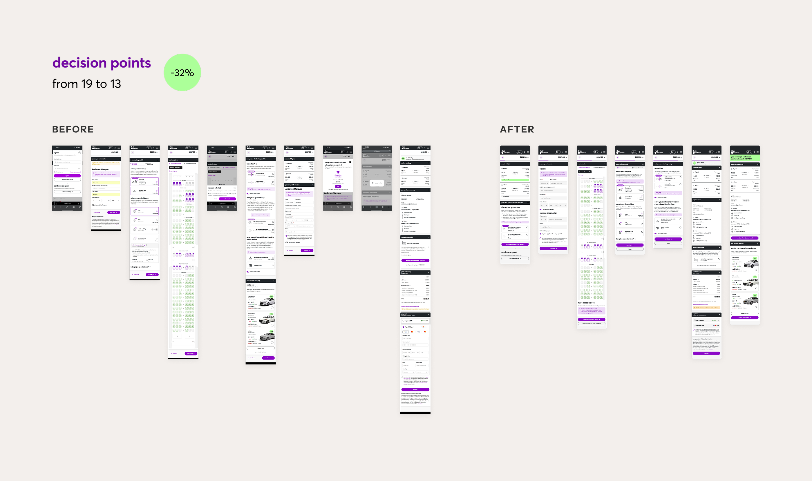
Screens comparison before and after redesign
My Design Rationale
I reorganized all upgrade options into two pages, taking into consideration their categories (Luggage and Insurance), and added a clear “Skip upgrades for now” path to reduce cognitive load.
Why I Made This Decision
Low‑cost travellers want control and speed. Concentrating decisions in one place keeps upsells visible while respecting the primary goal: finishing the booking.
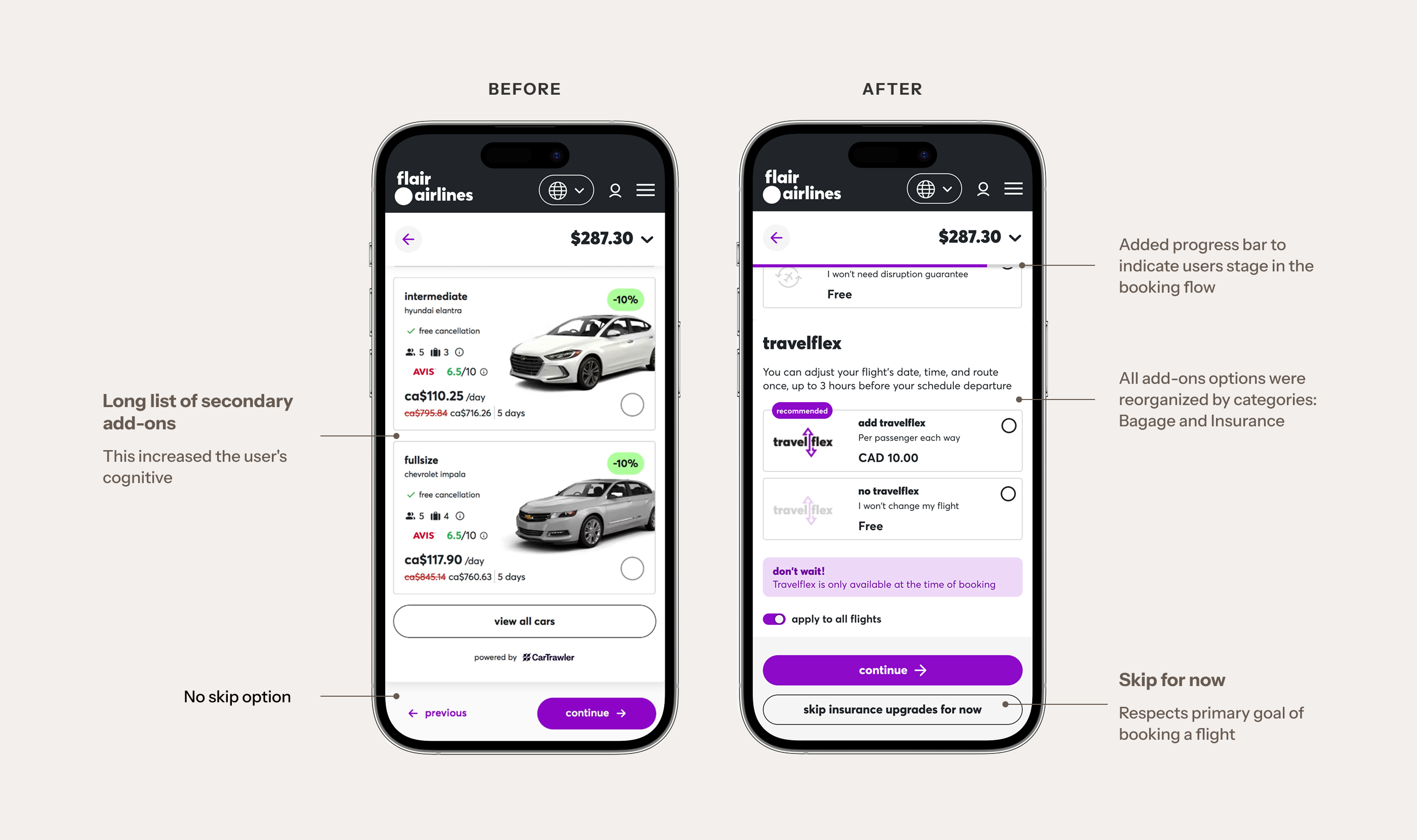
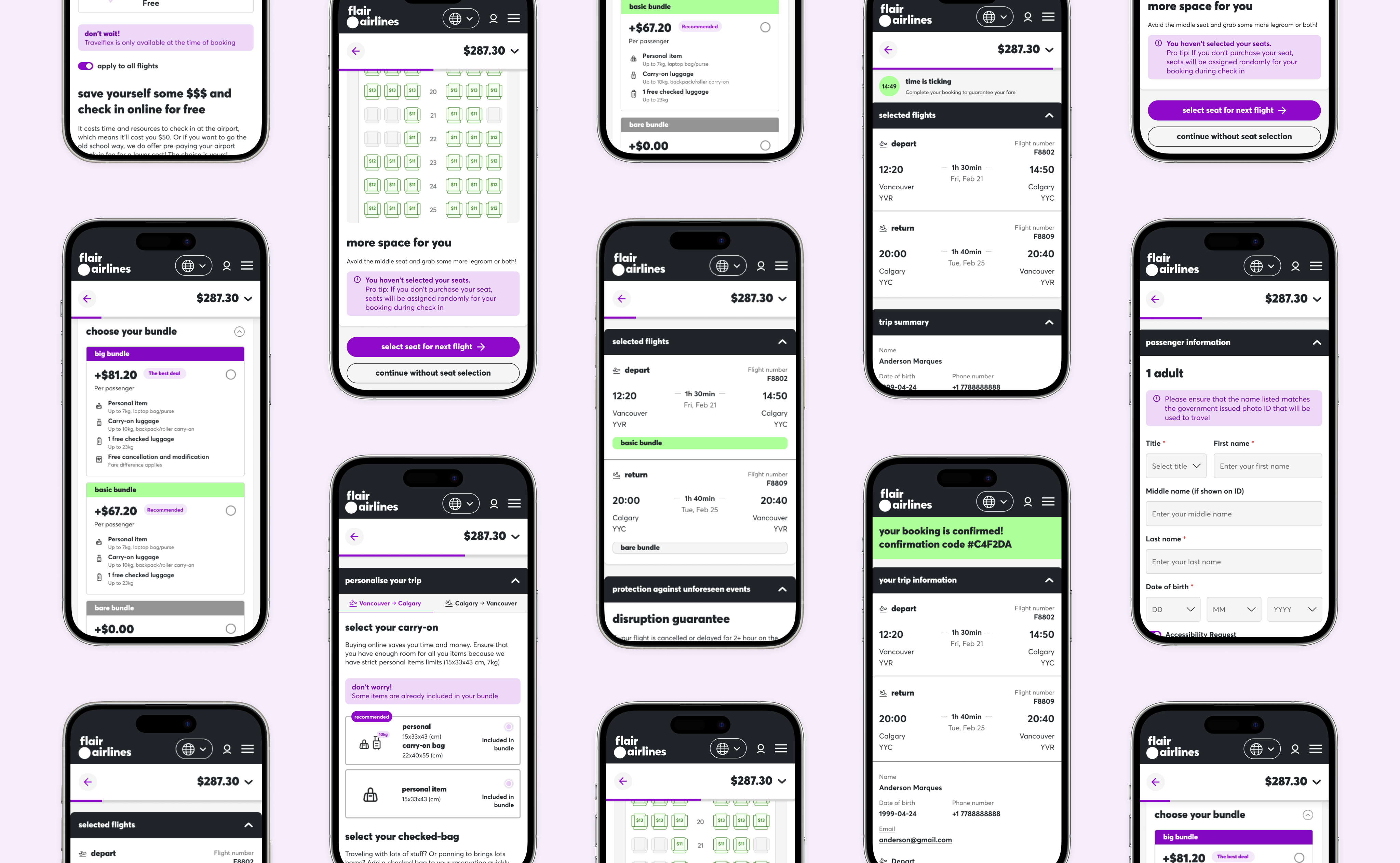
One of the add-ons page comparison
Outcome
Decision points reduced from 19 to 13
Protection add‑ons chosen intentionally, not by default
Design recommendation 2 – Clarify bundle navigation and build trust
The Problem This Solved
Bundle cards on mobile looked confusing with a horizontal carousel, making it hard to see what users were paying for or why one bundle cost more.
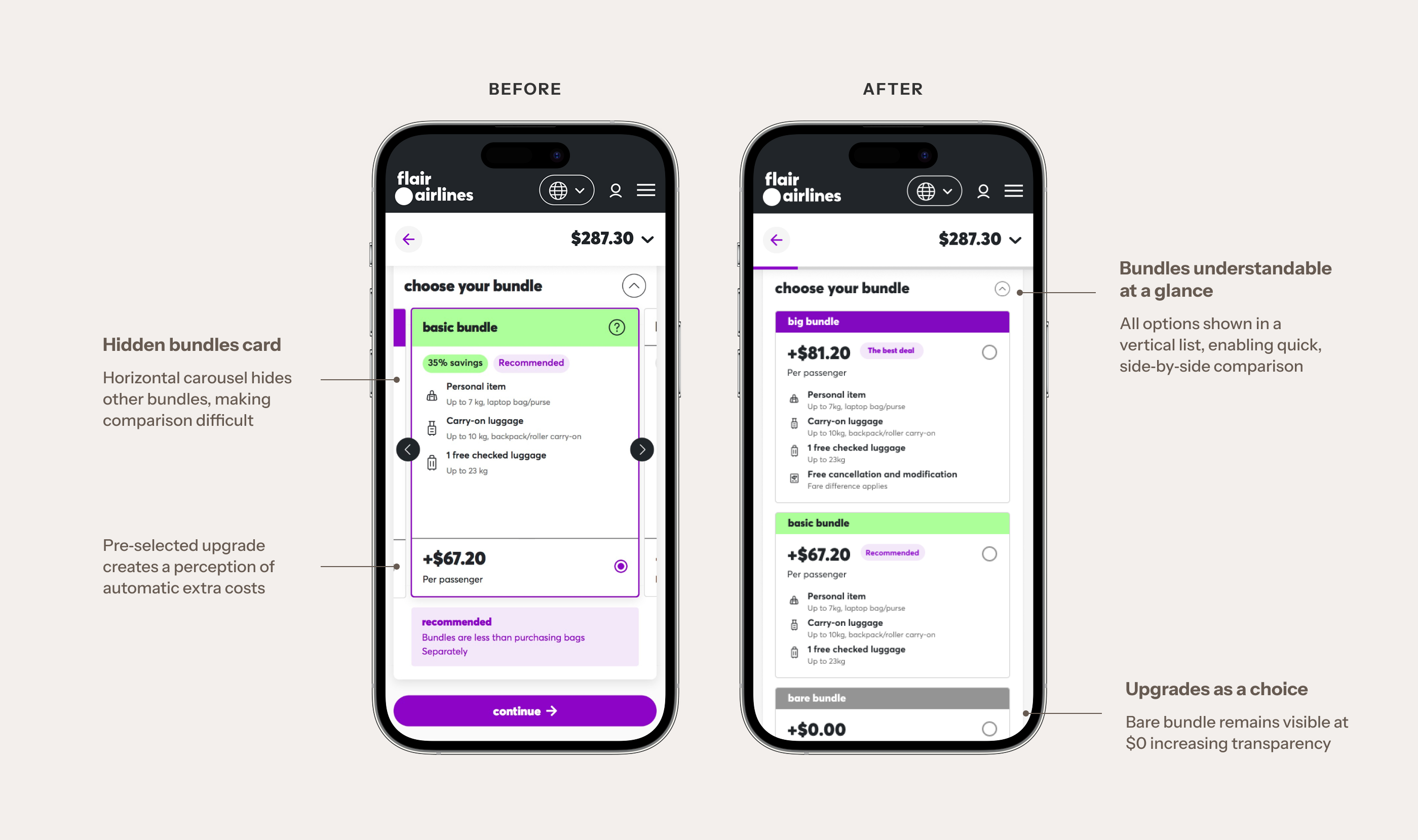
Comparison of original vs. redesigned bundle cards
My Design Rationale
I redesigned bundle cards with a vertical layout and visual hierarchy that highlights the recommended option and price differences.
Why I Made This Decision
Transparent bundles reduce comparison friction and build trust, while still supporting upsell goals by clearly communicating added value in higher tiers.
Outcome
Faster bundle selection at first glance
Incresed confidence while booking
Design recommendation 3 – Make seat selection feel fair and optional
The Problem This Solved
Seat selection screens felt pushy, hiding free or auto‑assigned options and forcing users into paid seats before they understood the impact on price.
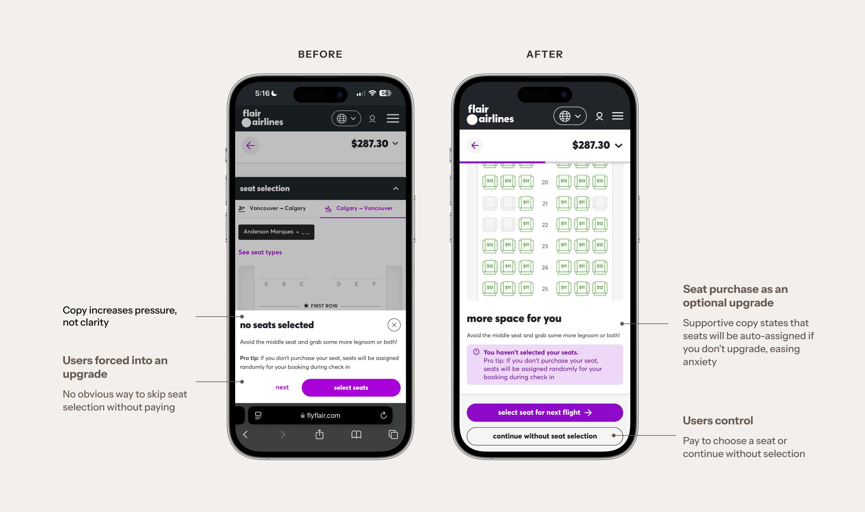
Comparison of original vs. redesigned seat selection
My Design Rationale
I added a clear “continue without seat selection” option, clarified which seats were free vs. paid, and added upfront messaging about price changes.
Why I Made This Decision
Framing seat choice as an optional upgrade, aligns with ethical UX, preserves revenue, and reduces the sense of being tricked.
Outcome
Fewer complaints about “forced” seat fees
Upsell revenue maintained through clearer value framing
Reduced abandonment during seat selection
What I got from this challenge
Prioritization is the real design challenge
With a tight timeline, it wasn’t realistic to “fix everything.” I had to focus on changes that would benefit both the user and the business. By concentrating on simplifying decision points, clarifying pricing, and making upsells feel optional rather than forced, I was able to create a more user-friendly experience that still aligned with Flair's revenue goals.
Transparency is a growth strategy, not a nice‑to‑have
Clear pricing and honest copy around upgrades reduced friction without killing upsells. Treating revenue goals and user trust as equal constraints produced a solution that feels both ethical and commercially viable. This project reinforces that better UX is better business. When customers feel respected and informed, they're more likely to complete their purchase, recommend the service, and return for future bookings.